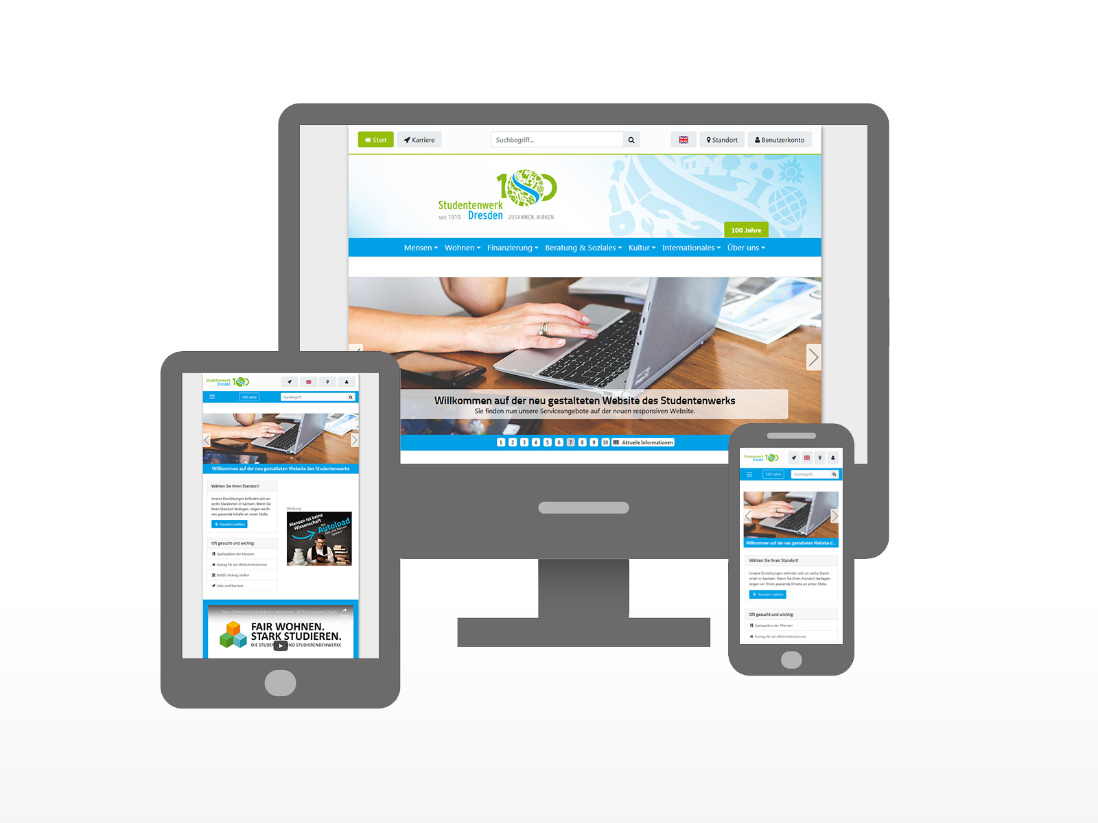
Our website for smartphones and tablets
In December 2018, we launched our new responsive website. You can now finally use this new version on your smartphone and tablet. A separate website for mobile devices, as previously provided under the address m.studentenwerk-dresden.de, is now no longer necessary. We have therefore shut down this separate mobile website as of 23 January 2019.
Thanks for your understanding and we would be pleased if you continue to use our website as intensively as before.
Your contact person for queries
If you have any questions about our website or experience problems using it, please send us an email or use our central contact form to let us know:
webmaster@studentenwerk-dresden.de To the contact formWhat exactly does responsive web design mean?
Responsive web design enables optimal rendering and usability of a website on mobile devices such as smartphones or tablets, but also on classic computers such as PCs or notebooks. This is achieved by automatically adapting the display to the device currently in use. Depending on the available screen space, elements of the website are shown or hidden or the arrangement and order is changed. Responsive web design also ensures that navigation, buttons, and form fields optimally operate on devices with touch displays too.